MUSINGS, INSPIRATIONS, RECIPES, FEATURES & MORE
LATEST / INTERIORS INSPIRATION / COUNTRY & PERIOD HOUSE GUIDES / MUSINGS / SUSTAINABILITY / FEATURES / HEALTHY LIVING
COLOUR PSYCHOLOGY IN INTERIORS

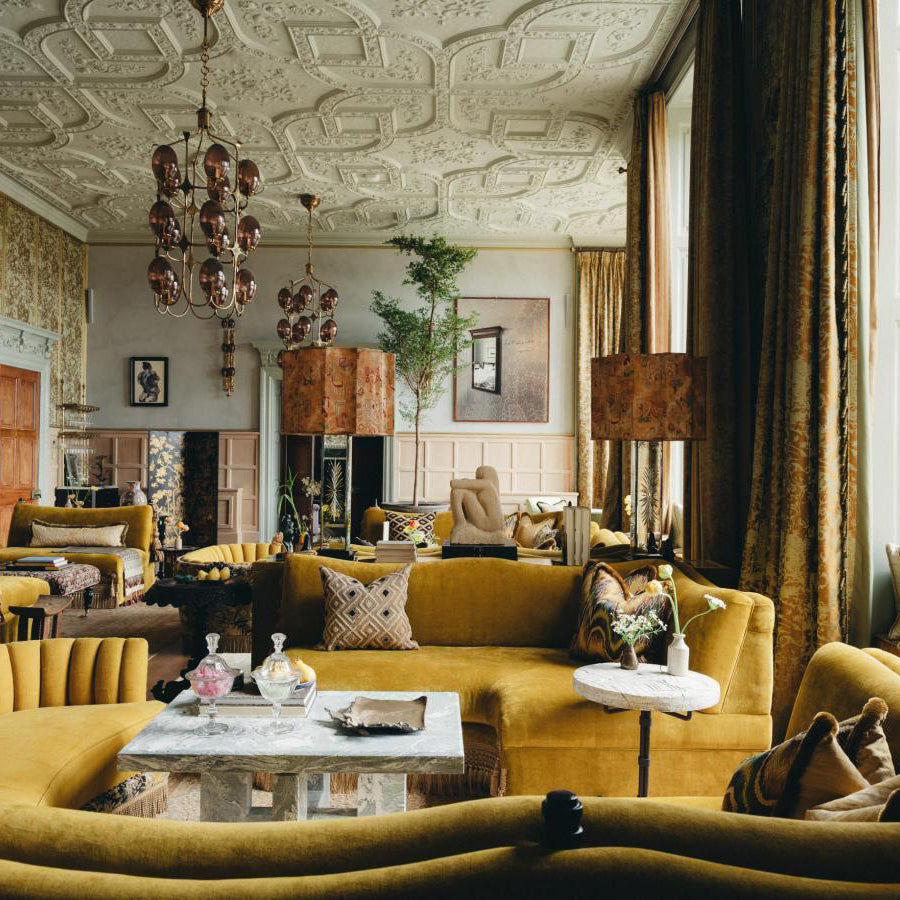
Image left: The New Road Residence. Image right: llcompany
Colour is one of the most powerful tools we have at our disposal when it comes to creating a space that is both visually appealing and emotionally supportive. By understanding how different colours affect our mood, we can create spaces that promote relaxation, focus, creativity, and more.
HOW COLOUR AFFECTS OUR MOOD
Colour has a direct impact on our mood and emotions. This is because colour is processed by the same part of the brain that processes emotions. When we see a colour, it triggers a release of hormones and neurotransmitters that can affect our mood, energy levels, and cognitive function.

WARM COLOURS
Warm colours, such as red, orange, and yellow, are associated with energy, excitement, and passion. They can be used to create a sense of warmth and cosiness in a room, or to add a touch of drama and excitement.
Red: Red is the most stimulating colour on the spectrum, and it is often used in kitchens and dining rooms to stimulate appetite and conversation. It can also be used to create a sense of drama and excitement in a room, such as in an accent wall or fireplace. However, it is important to use red sparingly, as too much red can be overwhelming.
Orange: Orange is a cheerful and optimistic colour that can be used to create a warm and inviting space. It is often used in living rooms and family rooms to promote conversation and socialisation. Orange can also be used to accentuate other colours in a room, such as red or yellow.
Yellow: Yellow is another cheerful colour that is often associated with happiness and sunshine. It can be used to create a bright and airy space, or to add a touch of warmth to a room. Yellow is often used in kitchens and bathrooms to promote energy and positivity.

COOL COLOURS
Cool colours, such as blue, green, and purple, are associated with calm, relaxation, and peace. They can be used to create a sense of tranquility in a room, or to promote focus and concentration.
Blue: Blue is the most calming and relaxing colour on the spectrum, and it is often used in bedrooms and bathrooms to promote sleep and relaxation. Blue can also be used to create a sense of tranquility in other areas of the home, such as in a home office or living room.
Green: Green is a versatile colour that can be used to create a variety of moods and atmospheres. It is often associated with nature and growth, and it can be used to create a sense of calm and relaxation in a room. Green can also be used to promote focus and concentration, making it a good choice for home offices and study areas.
Purple: Purple is a royal and luxurious colour that is often associated with mystery and intrigue. It can be used to create a sense of sophistication and elegance in a room, or to add a touch of drama and excitement. Purple is often used in living rooms, bedrooms, and dining rooms.

NEUTRAL COLOURS
Neutral colours, such as white, black, and beige, are versatile and can be used to create a variety of moods. They can be used to create a minimalist and modern look, or to add warmth and texture to a room.
White: White is a clean and fresh colour that can be used to create a bright and airy space. It is often used in kitchens, bathrooms, and bedrooms to create a sense of cleanliness and hygiene. White can also be used to accentuate other colours in a room.
Black: Black is a bold and dramatic colour that can be used to create a sense of sophistication and elegance in a room. It is often used as an accent colour to highlight other colours in a room, or to create a focal point, such as a fireplace or accent wall.
Beige: Beige is a warm and neutral colour that can be used to create a sense of comfort and relaxation in a room. It is often used in living rooms and bedrooms to create a cosy and inviting space.
HOW TO USE COLOUR PSYCHOLOGY IN INTERIORS
When using colour psychology in interiors, it is important to consider the overall mood and atmosphere you want to create. You should also consider the function of the space, as well as the personal preferences of the people who will be using it.
Here are a few tips for using colour psychology in interiors:
Use warm colours to create a sense of warmth and cosiness. Warm colours such as red, orange, and yellow are often used in living rooms, dining rooms, and bedrooms to create a welcoming and inviting atmosphere.
Use cool colours to create a sense of calm and relaxation. Cool colours such as blue, green, and purple are often used in bedrooms and bathrooms to promote sleep and relaxation. Cool colours can also be used in other areas of the home, such as in a home office or living room, to create a more calming and tranquil space.
Use neutral colours to create a sense of balance and harmony. Neutral colours such as white, black, and beige can be used to create a variety of moods and atmospheres, depending on the other colours that are used in the space. Neutral colours can also be used to highlight other colours in the room.
Use accent colours to add interest and excitement to a space. Accent colours are typically used in small doses to add a touch of drama or personality to a room. Accent colours can be any colour, but they are most often warm or bold colours.

Green 'colour drench' kitchen by Placement
COLOUR PSYCHOLOGY FOR DIFFERENT ROOMS IN THE HOME
Here are some specific tips for using colour psychology in different rooms in the home:
Living room: The living room is a space where people come together to relax, socialise, and entertain. Warm colours such as red, orange, and yellow are often used in living rooms to create a warm and inviting atmosphere. Cool colours such as blue and green can also be used in living rooms to create a more calming and relaxing space.
Bedroom: The bedroom is a space where people come to relax and unwind. Cool colours such as blue, green, and purple are often used in bedrooms to promote sleep and relaxation. Neutral colours such as white and beige can also be used in bedrooms to create a calming and serene atmosphere.
Kitchen: The kitchen is a space where people come to cook and eat. Warm colours such as red, orange, and yellow are often used in kitchens to stimulate appetite and conversation. Cool colours such as blue and green can also be used in kitchens to create a more calming and relaxing atmosphere.
Bathroom: The bathroom is a space where people come to relax and unwind. Cool colours such as blue, green, and purple are often used in bathrooms to promote relaxation. Neutral colours such as white and beige can also be used in bathrooms to create a clean and fresh atmosphere.
Home office: The home office is a space where people come to focus and work. Cool colours such as blue, green, and purple are often used in home offices to promote focus and concentration. Neutral colours such as white and beige can also be used in home offices to create a clean and organised atmosphere.

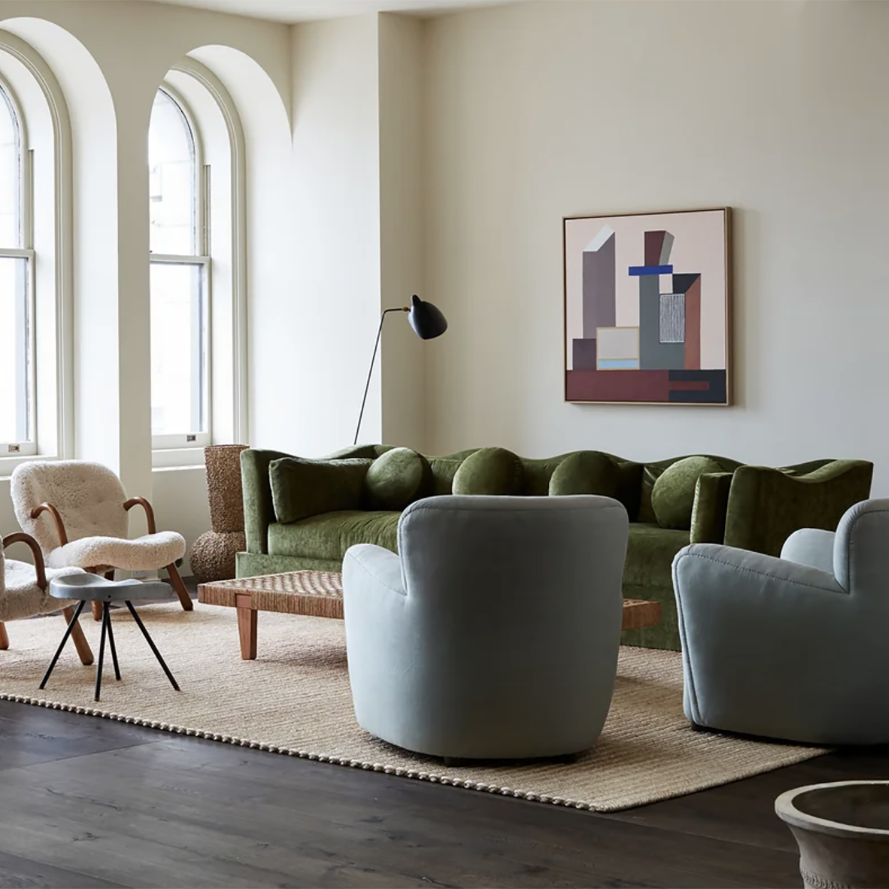
Image left: Studio Lawahl. Image right: Living Etc
ADDITIONAL TIPS FOR USING COLOUR PSYCHOLOGY IN INTERIORS
Consider the natural light in the room. Rooms with a lot of natural light can handle bolder colours, while rooms with less natural light may need lighter colours to make them feel brighter and more airy.
Use colour to create a sense of balance. If you are using a bold colour in one area of a room, try to balance it out with lighter colours in other areas of the room.
Don't be afraid to experiment. There are no hard and fast rules when it comes to using color psychology in interiors. The best way to find out what works for you is to experiment with different colours and combinations until you find something that you love.
Use colour to highlight architectural features. For example, you could paint a fireplace or accent wall a bold colour to draw attention to it.
Use colour to tie a room together. By using complementary or analogous colorus in a room, you can create a unified and cohesive look.
Use colour to create zones in a room. For example, you could use a warm colour, such as red or orange, to create a cosy conversation area in a living room, and a cool colour, such as blue or green, to create a more relaxing space for reading or watching TV.
Use colour to create a sense of depth in a room. By painting the walls a darker colour than the ceiling, you can create the illusion of a taller room.
Use colour to affect your perception of space. In general, lighter colours make a room feel larger, while darker colours make a room feel smaller.
Use colour to influence your mood. Warm colours tend to energise and excite, while cool colours tend to calm and relax.
Use colour to create a sense of personality. Your choice of colours should reflect your unique style and taste.
Don't be afraid to ask for help. If you're not sure where to start, there are plenty of resources available to help you choose the right colours for your home. You can consult with an interior designer, or you can do some research online or in books.

Image: Chad Dorsey
Remember, colour psychology is a powerful tool that can be used to create a variety of moods and atmospheres in your home. By understanding how different colours affect our emotions, you can create spaces that promote relaxation, focus, creativity, and more.